Ted Baker Toiletries
BRAND RE-LAUNCH / PACKAGING DESIGN / STRUCTURAL DESIGN
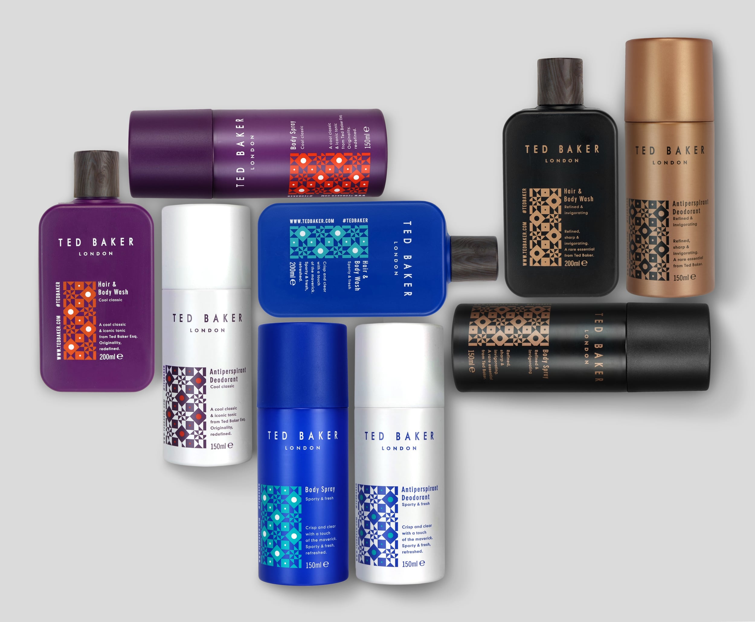
Formerly Ted Baker’s men’s toiletries range had been regularly re-designed, adopting a new novelty theme each time. The brand felt that perhaps it was time for their toiletries range to mature and take on a look and feel with some longevity. We were briefed with the creation of an entirely new look, bringing sophistication and a more premium feel to the range.
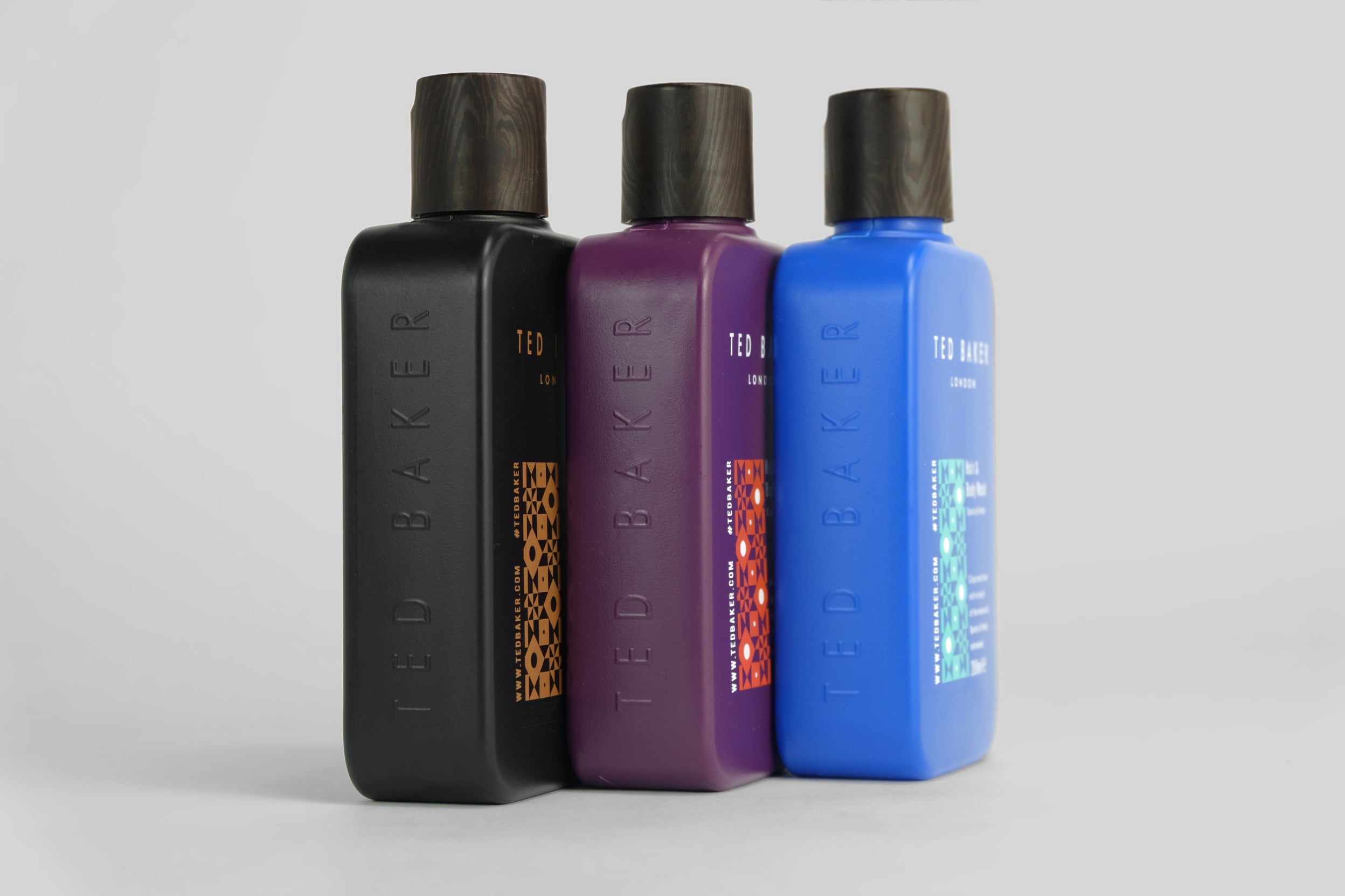
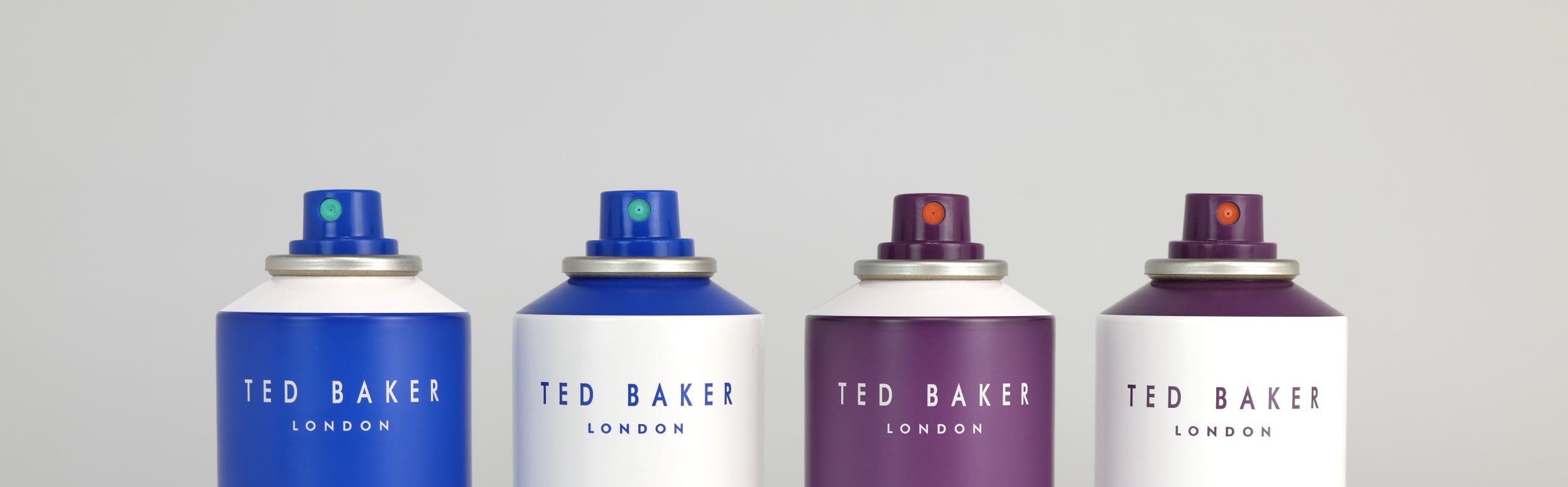
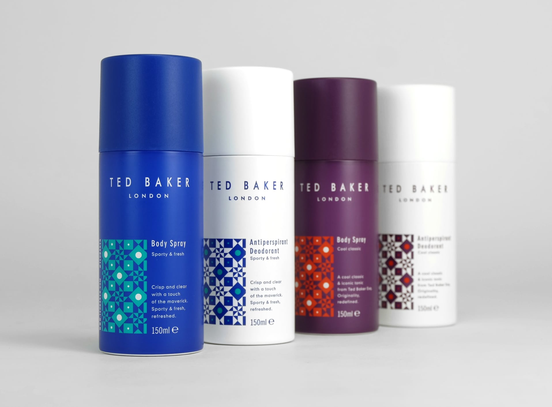
The new bottle was inspired by a hip flask, with rounded corners and vertical embossing on the sides, akin to that of an antique spirit bottle. Inspired by Ted Baker’s existing patterns used across their clothing ranges, I created a new geometric exclusively for the range. Combined with bold colour combinations and a natural wood texture on the lids, this created a contemporary feel with hidden pops of colour under the lids providing a reveal of detail which is synonymous with Ted Baker products.